This is another installment of the development of The Legend of Lop-eared Larry. I thought it would be fun to see the progression and decision making that went into an illustration via exerpts from emails between illustrator Brittany and me.
March 9, 2021
Brittany: Here is the first pdf mockup of Lop Eared Larry. I used Helvetica neue for the body text and an adobe font called Active for all the headings/our names/etc. The Headings are 18pt and the body text is 12pt.
Some of the illustrations look sort of weird and don't reach to the full bleed (which you won't see but I can see on my end and I'm sure the printers will see) We do run the risk of having white space showing up on the page just in case it gets cut different with the publisher. We can shrink the images to the same size as the text, maybe add some sort of border that encases the illustration. Let me know what you think.
Me: I just printed this out and made a dummy to see how it would look. It's so helpful to see it as a book!
Overall, love! Your illustrations are so charming. I like the font you chose for the chapter heads. I am wondering about a serif vs. sans serif body font though to make it feel more cozy and traditional. What do you think?
I do want to print the 5x7 trim size. I'm not quite understanding what you're saying about the illustrations. Are you wanting bleeds or thinking of shrinking the f-p ones and adding a border would be better? Not having bleeds might be less expensive?
There is also a blank page that I see an opportunity for a full-color illustration of Larry and his family so wanted to see if you'd be interested in developing one more illo.
March 31, 2021
Brittany: Here are two sketches of Larry’s family. One is of them in the park running around flying kites, having a picnic and creating art. The second is a shot from above them they’re all laying in the grass blowing bubbles and drawing but they all look like Lop bunnies so I thought that it might reflect how Larry is feeling about being the only Lop.

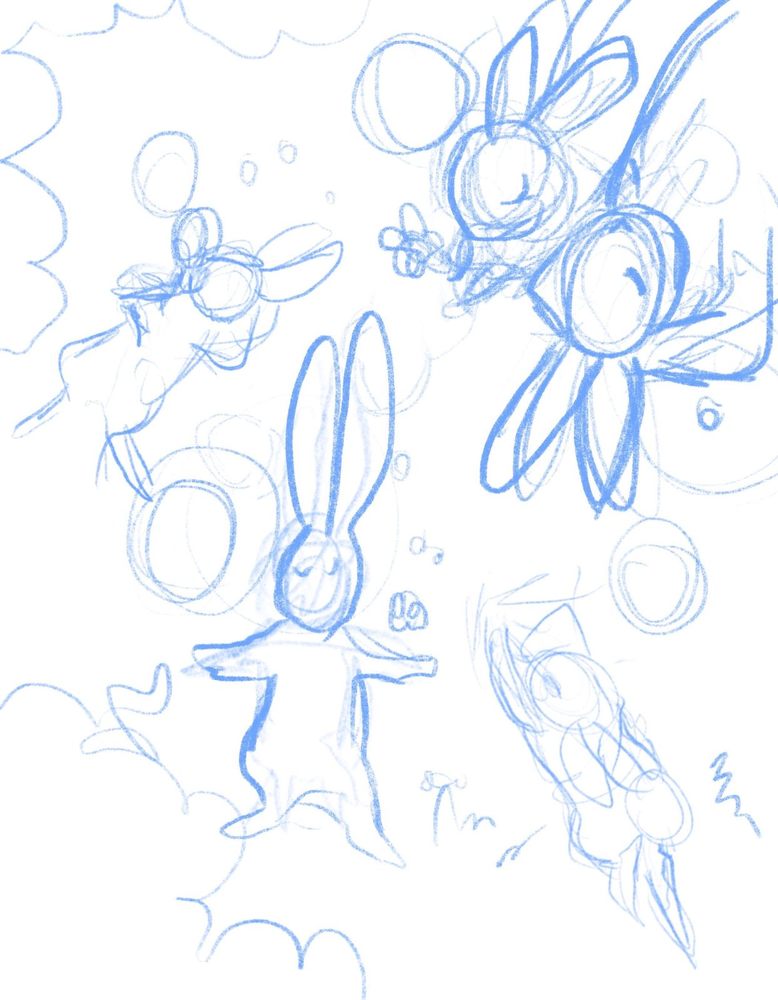
Me: I agree with you that the sketch with them laying in the grass makes them look like they have lop ears so that wouldn't work. The illo needs to distinguish Larry from the others in his family. I like the idea of blowing bubbles though. Perhaps Mr. and Mrs. Paws are sitting on a blanket with a picnic basket in background, lovingly watching their children play, while Larry and his sisters are standing up blowing bubbles. That way you can see that Larry's ears are down and all others are up. What do you think of that idea?
April 10, 2011
Brittany: Here is mid sketch phase with more details. I’m still working on Larry and his sister with the kite in the back.

April 19, 2021
Brittany: Here is the value & color studies as well as the linework. Please review these and let me know what you think. I decided to do the bunny patterns on the value studies, so if you like certain patterns with certain colors let me know they are pretty interchangeable. I thought it would be easier to see them in the value studies.

I did stick with the original color palette and just tried to make a few different variations while keeping the same colors for Larry, his parents and the grass and bush.


Me: I like the #3 color one that's more intense in color. Only thing is I'd like the girl behind/above the mother rabbit to have the yellow dress instead of white. And if you can tweak it a touch so that Larry stands out against the grass.
Brittany: That sounds great, what about the value studies? The value studies determine lighting and the overall feel of the piece.
Me: I'm not really sure how to choose a value study. #1?
Brittany: With these value studies, it's all about lighting, how dark the background is compared to the character and vise versa.
Me: I'm going to let you choose. I'm thinking it should be similar to the values you've already used in the other illos.
Brittany: For sure I will start the finals!
If you'd like to see how the colors came out, preorder a copy here.
Read More: